

Your UI looks perfect in the Game view, then you build for a phone and the buttons are tiny, the health bar is half off-screen, and the notch covers your pause button. Making Unity UI scale to every screen size comes down to three things: the Canvas Scaler, anchors, and safe areas. This guide explains each, gives settings that work for PC and mobile, and shows how to test resolutions properly before players find the problems for you.
Canvas Scaler Modes
Every Canvas has a Canvas Scaler component with three UI Scale Modes:
| Mode | Behaviour | Use it for |
|---|---|---|
| Constant Pixel Size (default) | UI elements stay the same number of pixels | Almost never for games: tiny on 4K, huge on low-res |
| Scale With Screen Size | UI scales relative to a reference resolution | Most games, PC and mobile |
| Constant Physical Size | UI stays the same physical size (mm) using DPI | Tools and apps where touch targets must be a real-world size |
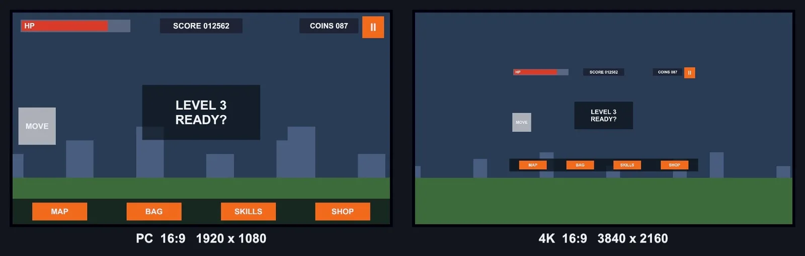
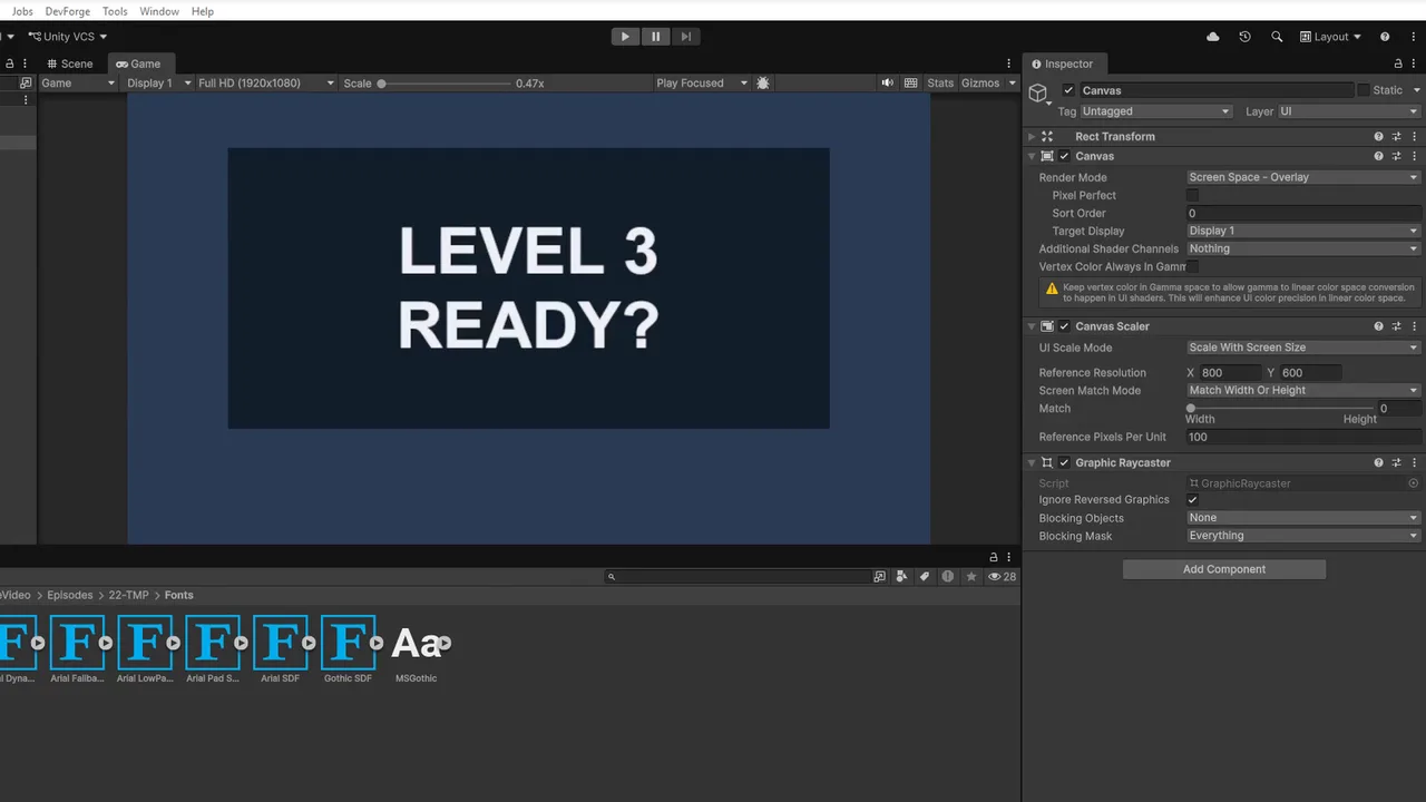
The default is the trap. Change it to Scale With Screen Size and set a Reference Resolution, the resolution you design at. Common choices are 1920×1080 for landscape and 1080×1920 for portrait mobile. Design every element at that size, and Unity scales the whole canvas up or down to fit the actual screen.
Match Width or Height
When the screen’s aspect ratio differs from the reference, the scaler can’t match both dimensions, so Match (0–1) decides which one wins:
- 0 (Width): the UI scales by width. On a taller screen, you get extra vertical space. On a wider screen, everything gets bigger and can run off the top and bottom.
- 1 (Height): the UI scales by height. On a wider screen, you get extra horizontal space. On a narrower (taller) screen, things may be cut off at the sides.
- 0.5: a compromise.
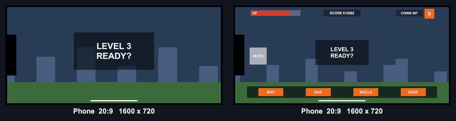
Rules of thumb: landscape games use Match = 1 (height), because wider phones and ultrawides just add room at the sides. Portrait games use Match = 0 (width), because taller phones just add room at the top and bottom. Then anchor elements to the edges (next section) so the extra space is used well.
Set Reference Pixels Per Unit to match your sprites’ Pixels Per Unit (100 by default) so 9-sliced borders look right.

Anchors and Pivots
The Canvas Scaler handles size. Anchors handle position. An anchor pins an element to a point (or stretches it between points) of its parent:
- A pause button anchored top-right stays in the top-right corner on every aspect ratio.
- A health bar anchored top-left stays top-left.
- A bottom menu bar with anchors stretched horizontally across the bottom always spans the full width.
- A centred popup anchored to the middle stays centred.
Use the anchor presets (the square icon in the Rect Transform). Hold Alt while clicking a preset to move the element there too, and Shift to set the pivot. Elements left with centre anchors drift away from edges on different aspect ratios, which is the most common “UI is off-screen on some phones” cause.
The pivot is the point the element positions and scales around. Set a top-right button’s pivot to (1, 1) so its position is measured from its own corner.
Layout Groups and Content Size
For lists, inventories and button rows, let Unity position things:
- Horizontal/Vertical Layout Group: arranges children in a row or column with spacing and padding.
- Grid Layout Group: fixed-size cells in a grid. Set Constraint: Fixed Column Count for predictable layouts.
- Content Size Fitter: resizes an element to fit its content (for example a text bubble that grows with its text).
- Layout Element: sets min/preferred/flexible sizes for a child.
- Aspect Ratio Fitter: keeps an image or panel at a fixed aspect ratio while it stretches.
Layout groups rebuild when children change, so avoid putting frequently changing items (timers) inside big layout groups. Split dynamic UI onto its own canvas, as covered in our performance budgets guide.
Safe Area for Notches
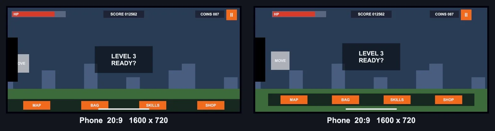
Phones with notches, punch-hole cameras and rounded corners report a safe area, the part of the screen guaranteed to be visible and touchable. Put all interactive UI inside a panel that resizes to it:
using UnityEngine;

[RequireComponent(typeof(RectTransform))]
public class SafeArea : MonoBehaviour
{
    RectTransform rect;
    Rect lastSafeArea;
    Vector2Int lastScreen;

    void Awake()
    {
        rect = GetComponent<RectTransform>();
        Apply();
    }

    void Update()
    {
        if (Screen.safeArea != lastSafeArea || Screen.width != lastScreen.x || Screen.height != lastScreen.y)
            Apply();
    }

    void Apply()
    {
        Rect safe = Screen.safeArea;
        lastSafeArea = safe;
        lastScreen = new Vector2Int(Screen.width, Screen.height);

        Vector2 min = safe.position;
        Vector2 max = safe.position + safe.size;
        min.x /= Screen.width;  min.y /= Screen.height;
        max.x /= Screen.width;  max.y /= Screen.height;

        rect.anchorMin = min;
        rect.anchorMax = max;
        rect.offsetMin = rect.offsetMax = Vector2.zero;
    }
}
Create a full-screen child of the canvas called SafeArea, add this script, and put your HUD inside it. Backgrounds can stay outside so they still fill the whole screen. The check in Update handles rotation. The Device Simulator (below) shows the safe area so you can test without a phone.
Ultra-Wide and Tablet Aspect Ratios
Test the extremes, not just 16:9:
- 21:9 and 32:9 ultrawide (PC): with Match = 1, corner-anchored elements end up far apart. Some games wrap the HUD in a panel with a max width (a Layout Element or a script that clamps width) so it stays readable.
- 4:3 tablets (iPad): narrower than 16:9. With Match = 1, side elements may overlap. Use Match around 0.5, or check overlaps.
- 19.5:9 and taller phones: common now. Make sure portrait layouts don’t leave a big empty band.
📱 Testing on real devices?
The Device Simulator is great, but nothing beats a real phone and a second monitor. Our dev hardware guide covers affordable setups that make multi-resolution testing painless.
Testing Resolutions
- In the Game view, use the aspect dropdown and add custom resolutions (2340×1080, 2560×1080, 2048×1536). Turn off Low Resolution Aspect Ratios for sharp previews.
- Switch the Game view tab to Simulator (Device Simulator). Pick an iPhone or Android device and it shows the notch, safe area and actual DPI. It’s ideal for testing the SafeArea script.
- Drag the Game view window to resize it freely and watch anchors respond in real time.
- Check both orientations if your game allows rotation.
Troubleshooting
UI looks tiny on a 4K monitor or phone
The Canvas Scaler is on Constant Pixel Size. Switch to Scale With Screen Size with a 1920×1080 (or 1080×1920) reference.
UI elements are cut off on some phones
The elements are anchored to the centre instead of the edges, or Match favours the wrong dimension. Anchor to edges and use Match = 1 for landscape, 0 for portrait.
Buttons hidden behind the notch
Put interactive UI inside a SafeArea panel.
UI looks right in the Editor but wrong in the build
The Game view was set to Free Aspect or a different resolution than the device. Test with fixed device resolutions or the Simulator. Also check the build doesn’t use a fixed windowed size in Player Settings.
Text becomes blurry when scaled
Use TextMeshPro, which stays sharp at any scale. See our TextMeshPro tutorial.
FAQ
What reference resolution should I use?
1920×1080 for landscape games and 1080×1920 for portrait mobile games are the standard choices.
Should Match be width or height?
Height (1) for landscape games and width (0) for portrait games, combined with edge anchors.
What’s the difference between anchors and pivot?
Anchors pin an element to points of its parent. The pivot is the element’s own reference point for position, rotation and scale.
How do I handle the iPhone notch in Unity?
Use Screen.safeArea to resize a container panel, and keep interactive UI inside it.
Does the Canvas Scaler work with World Space canvases?
No. Scale modes only apply to Screen Space canvases. World Space canvases use Dynamic Pixels Per Unit for text sharpness.
Reader questions
Asked by readers of this article and answered by AI. Behavior can differ between Unity versions, so test in yours.


Leave a Reply